UX Diary #2
Short Write-Ups
Good Example - Boba Checkout Kiosk
What is the User Goal?
To select their boba/tea order, proceed to the checkout, and complete their payment.
How does the design help users in achieving their goals?
The checkout kiosks are large touch screens that are easy to use and understand.
- Visibility of System Status is exemplified well through these kiosks as they have a clear checkout flow and respond to touch/tap directly and instantly with no delay.
- Consistency and Standards is another heuristic on full display as it follows common checkout systems (cart icon on top left, items and costs listed top to bottom) and is physically and functionally similar to other ordering kiosks, i.e., McDonald’s kiosks.
- The best UX principle displayed, however, is Aesthetic and Minimalist Design as the number of options is balanced, there is no visual clutter, and it is very organized and sleek. The menu is well organized between the different categories of drinks, which opens up another menu with specific drinks, but it is never overwhelming or overbearing. The number of available options is the right amount and is grouped well.
- The success of these kiosks can be seen by how widespread they are, as almost every boba shop, no matter how small, has at least one. Another piece of evidence for user understanding, while anecdotal, is how lines usually form for these kiosks, even if an employee is free or has a short line in front of her at the counter.
Bad Example - Music Interface while Music is Playing
What is the User Goal?
To shuffle music, loop music or a song, and/or add similar songs to a queue.
How does the design hinder users in achieving their goals?
As someone who did not listen to much music on my phone, it took me a long time to figure out how to get to the buttons to be able to shuffle and loop songs on certain music application. Unlike Spotify which shows the shuffle and loop button on the current song screen, some other music applications have no such features. Instead, there are usually three dots that open more options, but none of them are related to shuffling or looping the song. Instead, the user has to go to the playlist through the button on the bottom right and tap one of the traditional icons for shuffling or looping. However, some other music applications utilize an infinity icon, which is apparently to autoplay songs that are not in the playlist (which is something not easily conveyed).
There are a few issues with music. The main one being Consistency and Standards. Certain music applications violate this heuristic in two ways:
- The shuffle and loop button not being available on the song screen.
- The infinity icon is difficult to understand and does not correlate to other music listening platforms (also a recognition issue).
Not having the buttons available on the song screen additionally increases the motor and cognitive load for the user, as they have to do more to achieve what they normally can achieve on other platforms, i.e., Spotify.
Detailed Critique - Bad Example - Microwave
What is the User Goal?
To heat, reheat, cook, and/or defrost food, drinks, and/or other products.
How does the design hinder users in achieving their goals?
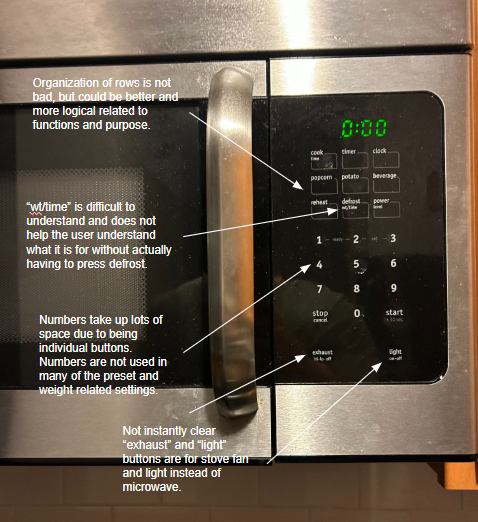
There is an overwhelming amount of buttons on the microwave, especially the numbers. The numbers are not used in half of the cases, so they occupy more physical/visual space and cognitive load than they need to. The order of the buttons does not seem to have much thought or rational behind them and seem to be ordered randomly. Internal consistency is another issue, as the defrost option says “wt/time” (ounce selection), however the reheat, popcorn, and most other options also makes you choose the ounce.
#1 and 2 have “ready” and “set” next to each other as well, but it is difficult to recognize what they do. Not only is recognition difficult, but I still to do not know what those two do after making an effort to figure out where and how I can use them. This microwave in particular has too many settings and choices, which can overwhelm users and leaves many functions unused.
Additionally, the microwave at my house is right above the stove and has an exhaust button and light button, which is for the stove fan and light. This was highly confusing for me the first couple of times and also causes trouble for guests and new people.

Could anything explain the poor design?
Microwaves more than likely have standard designs that are mass produced. This microwave combines most of the basic functions and features basic microwaves have. The numbers are fairly traditional, so they are most likely commonplace in many microwaves. I discuss a dial option instead of numbers in the next section, but upon doing some research; I found microwaves with dials tend to be more expensive than regular microwaves in general. This may not have to directly with the dials however, and may be because of microwaves with dials having more features/capabilities than regular microwaves. Dials are also not highly traditional for microwaves and may be a more difficult mechanism to integrate when manufacturing.
How would you make it better? How would your suggestion improve the design?
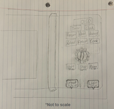
First of all, I would entirely remove the numbers from the microwave and a dial instead labeled 1 through 9, 10, 15, 20, 25, and 30 (“ready” and “set” would be removed as a result). The dial would be used in the same way as the numbers are used for adjusting cook time and power (selecting 1-10, with the “level” text under the “power” button also being changed to “1-10” and any number exceeding 10 equaling 10 power). The screen would show the number selected by the dial (the dial does not “tick” down on its own, and is only used to select numbers), and the user can press start to select time/power.
The “wt/time” would be removed from defrost for consistency sake and the ounce selection menu that follows it being easy to understand and use.I would also change the order of most of the buttons. For the bottom most buttons, I would order them “start” as the leftmost button, “stop” to the right, and the “power” button on the right. The dial would be above this row. “Reheat” and “defrost” would remain in the same place in the same row, but I would add cook time next to them, as they are the main three settings. The row above them would remain the same and the topmost row would be “timer” and “clock”. Finally, I would make the “exhaust” and “light” button further down and make them more distinct with small arrows pointing down.
How would you make it better? How would your suggestion improve the design?
The suggestion improve the design in multiple ways. The dial would free up space (minimalist design) and give users faster, smoother, and easier control while using the microwave (motor load). Admittedly, the dial does remove some precision, since directly punching in numbers let’s the user be completely accurate with their choice of time, but the dial allows for much faster and smoother control for the user, while lowering visual clutter from all the number buttons that are not used often. Another downside is that the dial makes setting up the clock and timer more difficult, but the clock only needs to be set and changed twice a year, and from my experience, neither my roommate or I use the timer due to phones and watches having more efficient and easier to set up timers. The dial has a visual benefit as well; making it more distinct and separate from many of the buttons and options (which already do not use numbers). Removing the “wt/time” would add more internal consistency to the control panel of the microwave. “Defrost” currently being the only button with the text under it adds unneeded confusion, since setting it up is no different than most of the other buttons and modes, as well as the “wt/time” not being text that is easy to process or understand. “Level” being changed to “1-10” allows the user to instantly see their options for power, and is a better scale than 1-9 as 1 to 10 can evoke 10 to 100 percent power.
The new way of grouping the rows should reduce the cognitive load as related things will be next to one another. The “start” button being on the left and the stop/cancel button being on the right of it adheres to industry conventions and what is usually considered the norm (“Yes” usually on the left, “”No” usually on the right). The “start” button having “+30” under it allows users to quick start by tapping it twice and add 30 seconds to any function, without invoking the use of the dial, giving the users more freedom and control. Keeping “stop” and “cancel” as they further provide more freedom and control to the user, since the user can cancel, stop, and restart anything at anytime. Lastly, the “exhaust” and “light” button being more separate from the rest of the microwave and having small arrows pointing down towards the stove lets first time users to quickly and easily understand that those two buttons are for the stove fan and lights, not the microwave.
Proposed Change:
