UX Diary #1
What I learned engaging with the UX community

Source: Posted by proce55or. Posted Jan. 23, 2019. Accessed Sept. 15, 2024. Reddit.
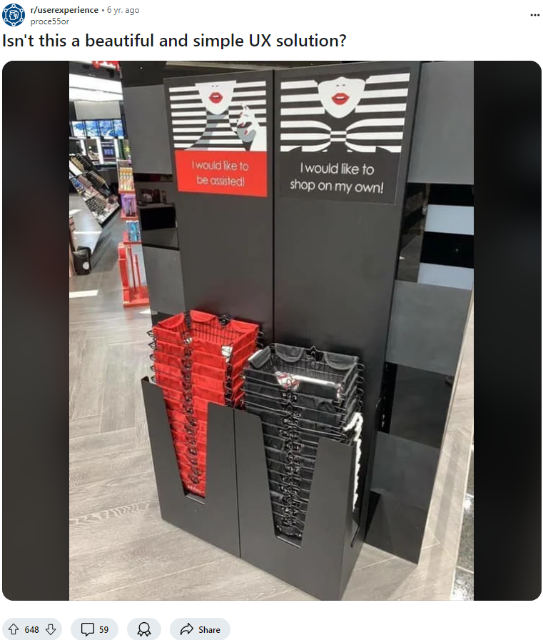
The first post is one of the top rated posts of all time in the UX reddit, and the photo depicts Sephora’s two options of a red basket if they want to be assisted and a black basket if they do not want to be assisted. The idea is that new customers will most likely use the red basket while experienced shoppers or shoppers who do not want to interact with workers at all will use the black basket. I selected this image and post for the diary for a couple reasons:
- Commenters point out that many people do not read things, so customers may just grab one of the baskets without reading.
- Building on that point, the image/design does not clearly display which image is for which choice.
- Some customers may not use a basket entirely, which this system does not cover.
- Another issue brought up by some commenters on the post is that there may be no baskets at certain times or baskets may be mixed up.
- The last main point is that a shopper’s needs may change throughout their shopping experience, so this does not address that well.
This post was a great opportunity for me to understand what UX is truly about, and observe how a good idea on the surface may have many problems underneath.
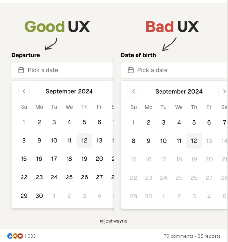
The second post is from LinkedIn, depicting the date selector for a departure and for date of birth. This example shows that just because something exists, does not mean it should be used. In this case, just because a date selector does exist, does not mean that it should be used in everything related to date, date of birth in this example. Just being able to type one’s date of birth would more than likely be easier than this method for the user, as being able to type it would achieve the goal much quicker and with less button presses/physical activity.
The comments on this post brought up the idea to potentially modify the date selector to start from year followed by month followed by day, or start from a “x” number of years ago. While these ideas are interesting, they may run into the same issue, and the original poster points out that the “year → month → day” design has been tested before with less than stellar results. The idea itself and the discussion surrounding it better help me understand when to use certain designs, if using certain designs is actually better than more straightforward and traditional approaches, and to be careful and do my research when generating and implementing less common and newer designs.

Source: Posted by Josh Wayne. Posted Sept. 2024. Accessed Sept. 15, 2024. LinkedIn.